Abstract Wall Art for Living Rooms: How to Choose by Color and Mood
Learn how to choose abstract wall art for your living room using color psychology and mood. Shop museum-quality framed prints at Nova Art Labs.
Imagine walking into a living room and feeling immediately at ease — the air softer, the pace slower, the whole space quietly welcoming. That shift doesn't happen by accident. More often than not, it begins on the walls.
Abstract wall art for living rooms does something furniture alone cannot: it sets the emotional temperature of a space. The right composition — its palette, movement, and scale — can make a room feel expansive or intimate, energized or serene. And yet most people choose wall art last, treating it as an afterthought rather than the design decision that anchors the entire room.
In this guide, we explore how to choose abstract wall art for your living room by leading with color and mood — the same way top interior designers approach the process. At Nova Art Labs, every framed print in our collection is curated with exactly this philosophy in mind.
Why Color Comes First in Living Room Art Selection
The most common mistake in choosing living room wall art is starting with style and ending with color — "I like this piece; does it match my sofa?" The more effective approach reverses the process entirely. Begin with the mood you want the room to create, then let color lead you to the right artwork.
Color is the most immediate communicator in any visual composition. Before you register line, subject, or composition, your eye responds to hue. Warm tones — terracotta, amber, burnt sienna, dusty coral — signal warmth, comfort, and sociability. Cooler palettes — sage, slate blue, soft teal, muted lavender — bring calm and introspective quiet. Neutral abstracts — cream, ecru, warm grey, soft black — ground a space without imposing a mood, giving the room flexibility and quiet sophistication.
Interior designers have long understood this. A living room painted in warm greige and furnished in linen and walnut doesn't just need art that "goes with" those tones — it needs art that amplifies them, deepens them, pulls the palette into a more intentional place. Abstract art, with its freedom from literal subject matter, is uniquely positioned to do exactly that.
The Emotional Palette Guide for Living Rooms
Before shopping for abstract wall art for your living room, identify the mood you want to anchor there:
- Warm and welcoming: Seek abstracts rich in terracotta, warm amber, dusty rose, and ochre. These palettes activate the social energy of a room, encouraging conversation and ease.
- Calm and grounding: Earth-toned abstracts in sage, dill green, warm clay, and ecru create spaces that feel rooted — think of the warmth of late afternoon light filtering through linen drapes.
- Sophisticated and dramatic: Deep navy, forest green, charcoal, and ink black with gold or cream accents elevate a room into formal territory that feels contemporary yet timeless.
- Airy and expansive: Soft blues, muted teal, pale lavender, and misty grey make rooms feel larger and lighter — particularly effective in smaller living spaces.

Scale, Composition, and Visual Weight
Once you've identified your palette, the next variable is scale. Abstract wall art for living rooms works best when it respects — and responds to — the architecture of the space.
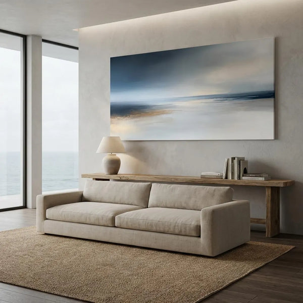
A single large-format abstract print — 40 × 50 inches or larger — can serve as the room's primary focal point, commanding the same visual authority as a fireplace or floor-to-ceiling windows. This is the approach interior editors at publications like Architectural Digest and Elle Decor favor: one statement piece rather than a cluttered arrangement of smaller works.
For longer walls or more open living areas, a diptych — two complementary panels in the same palette — extends the visual rhythm of a composition without losing cohesion. Alternatively, a curated gallery wall of three to five framed abstract prints in the same tonal family creates a collected, editorial feel that reads as deeply personal rather than formula-driven.
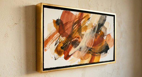
Framing and Finishing — Why It Matters as Much as the Print Itself
Even the most extraordinary abstract composition can be diminished by the wrong frame. The frame is the architectural threshold between the world of the art and the world of the room. At Nova Art Labs, our museum-quality framed prints are finished with carefully curated options — slim gold leaf for warm palettes, dark walnut for earthy or dramatic compositions, warm copper for terracotta-led works, and matte black for contemporary minimalist rooms.
A well-chosen frame elevates a print from a decorative object to a considered, gallery-worthy statement piece that gives a living room a sense of intention and permanence.
Room-by-Room Color Mood Guide
Different living spaces within a home call for different emotional registers — and different abstract palettes.
The main living room is typically the social center of a home, the space where energy and ease must coexist. Earth-toned abstracts in warm terracotta, amber, and cream are perennially effective here. They invite without overwhelming. In 2026, the leading interior design shift is away from matchy-matchy décor and toward art chosen for its emotional resonance — a piece you stop and look at each time you enter the room.
An open-plan living and dining area benefits from a larger-scale abstract that visually anchors both zones. Choose a composition with a dominant hue that threads through both spaces — perhaps a deep sage or a warm charcoal — and let the art create the continuity where architecture cannot.
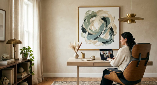
A smaller living room or reading nook calls for restraint. A single beautifully framed abstract print in a cooler, airier palette — soft blues, muted sage, pale lavender — expands the sense of space without cluttering it. Scale the print generously relative to the wall, leaving breathing room on all sides so the composition can speak clearly.
The 2026 Shift: Art Chosen for Feeling, Not Furniture
One of the most significant design movements of 2026 is the deliberate rejection of art as decoration. Across editorial interiors and design-forward homes, art is being chosen first — not as the final layer of a room scheme, but as its emotional foundation. The furniture follows the art.
This is exactly how abstract wall art for living rooms works at its best. A striking warm-toned abstract doesn't need to match a throw pillow. It needs to be the reason the throw pillow exists. Interior designers increasingly ask clients to identify a piece of art they love before selecting a single furniture item — and it changes everything about how the room takes shape.
At Nova Art Labs, our collections are built around this philosophy. Every print is curated as a statement piece — bold enough to anchor a room, refined enough to evolve with it. Our museum-quality framing means the art arrives ready to hang, ready to transform, ready to be the first thing you notice when you walk through the door.
Explore the full collection at novaartlabs.com, where you can browse by palette, mood, and room type to find the abstract print that sets the emotional tone your living room deserves.

Frequently Asked Questions
How do I choose the right abstract wall art for my living room? Start with the mood you want the room to create, then choose art based on color palette rather than style alone. Warm earthy tones encourage sociability and warmth; cooler palettes bring calm and expansiveness. At Nova Art Labs, you can browse curated collections by palette and room type at novaartlabs.com.
What size abstract wall art works best in a living room? For most living rooms, a single large-format print — 36 × 48 inches or larger — makes the most impact as a focal point. If your wall is very wide, a diptych or a small curated gallery of three to five pieces in the same tonal family creates a collected, editorial feel. Avoid pieces that are undersized for the wall — proportional scale is everything.
Does abstract wall art affect the mood of a room? Yes — significantly. Color is the most immediate communicator in any visual composition, and abstract art leverages this directly. Warm-toned abstracts in terracotta and amber signal comfort and sociability, while cooler blue-grey abstracts create calm. Research in environmental psychology consistently shows that color choices in a space influence how people feel and behave within it.
What is the best color for abstract wall art in a living room? It depends on your existing palette and desired mood. Warm earth tones — terracotta, ochre, burnt sienna — add energy and warmth. Sage and olive greens ground a space with natural calm. Deep navy or charcoal with gold accents creates a dramatic, sophisticated atmosphere. Nova Art Labs offers curated collections across all these palettes — browse by mood at novaartlabs.com.
Are framed art prints as impactful as original paintings in a living room? Absolutely. Museum-quality framed art prints — like those available at Nova Art Labs — deliver the full visual impact of the original composition with the added advantage of professional framing, consistent quality, and significantly greater accessibility. The frame itself plays a crucial role: the right choice elevates any print into a gallery-worthy statement piece.
Conclusion
The living room is the room that does the most work — socially, emotionally, aesthetically. Choosing abstract wall art that leads with color and mood rather than safe matching is one of the most effective investments you can make in your space.
Explore the Nova Art Labs collection at novaartlabs.com, where every abstract framed print is curated as a statement piece. Browse by palette, filter by room, and find the work that makes your living room feel exactly the way you've always imagined it could.