Home Office Wall Art: The Complete Style Guide
Home Office Wall Art That Works as Hard as You Do
Introduction
Most people choose wall art last. The best-designed rooms start with art first.
It's a counterintuitive idea — but the most productive, inspiring home offices have one thing in common: the art was chosen with intention, not afterthought. We spend weeks researching monitors and task chairs, then grab whatever print catches our eye on the way out of a furniture store. The result is a workspace that feels fine but never quite finished — and never quite energizing.
Home office wall art does more than fill empty wall space. It calibrates the emotional temperature of your entire workday. The colors, compositions, and visual rhythms you surround yourself with influence your focus, your creativity, and how you present yourself to the world on video calls. Getting it right starts with understanding a few key principles — and finding the pieces that serve your specific way of working.
The Psychology Behind Art and Productivity
There's real science behind why the art in your workspace matters. Research from the University of Exeter found that employees in offices enriched with art and plants were 15% more productive than those in lean, undecorated spaces. Visual stimulation affects our cognitive state — and abstract art, with its layered compositions and dynamic color fields, is particularly potent in this regard.
Abstract art invites the eye to move through a composition rather than land on a fixed image. That gentle, ongoing engagement keeps the visual cortex active at a low level, which neuroscientists associate with a relaxed-alert state — the same mental mode associated with deep focus and creative flow. This is why so many designers and architects specify modern abstract wall art for office environments over representational or photographic work.
The key is calibration, not just decoration. Choosing abstract prints for workspace that match your work style — rather than simply matching your sofa — is the difference between art that serves you and art that sits there.
Choosing Colors That Match the Way You Work
Color is the most powerful variable in any piece of office wall decor. And the right choice depends entirely on what your work demands of you each day.
For Creative Professionals
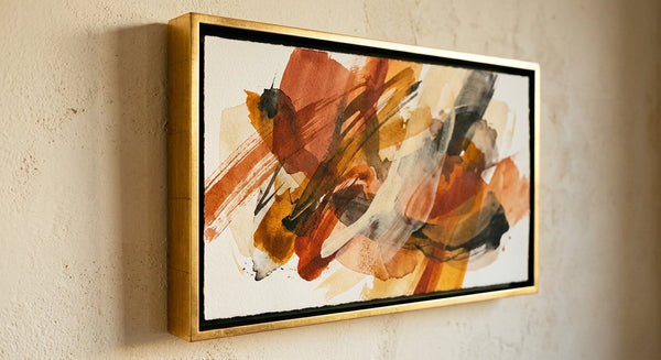
If your work lives in the realm of ideation, writing, design, or strategy, lean into warm-to-mid tones: burnt sienna, ochre, muted terracotta, or layered earthy golds. These hues stimulate associative thinking and signal permission to explore. An abstract composition with sweeping golden arcs over a warm cream field creates a visual environment that feels generative rather than constrictive.
For Analytical and Focus-Driven Work
Professionals in finance, law, engineering, or data analysis benefit from cooler palettes that reinforce clarity and concentration. Deep navy abstracts, cool charcoal-grey compositions, and soft blue-to-white gradients align with the focused, methodical mindset these roles require. Think of it as calibrating the visual frequency of your room to match the frequency of your thinking.
For High-Stress Roles
If your workday is defined by deadlines, client pressure, or rapid decision-making, restorative tones are your ally. Sage green, soft teal, and muted dusty lavender are colors consistently associated with stress reduction and emotional regulation. A single statement abstract print in these tones — placed directly in your sightline — functions as a visual anchor when the day gets demanding. This is art that boosts productivity not through stimulation, but through calm.

Size, Scale, and Placement: Getting It Right
The most common mistake in home office wall art is choosing a piece that's too small. A print that looks large in a gallery image can disappear entirely on a ten-foot wall. Here's a reliable framework for getting scale right.
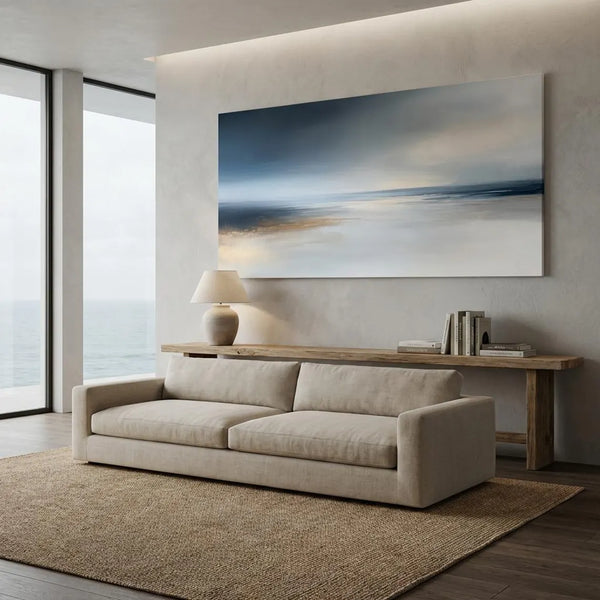
Above the desk: For the most common home office setup, a single statement print positioned above your monitor should be 60–80% of your desk's width. A desk that's 60 inches wide calls for a print in the 36–48 inch range. Hang the bottom edge approximately 6–8 inches above your monitor or desk surface.
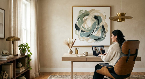
The primary sightline: If your desk faces a wall rather than a window, that wall is your most important canvas. A large-format abstract print — 30x40 inches or larger — hung at seated eye level transforms that wall into a daily source of visual inspiration. This placement also creates a natural focal point for video calls.
The side wall: A secondary wall or the wall perpendicular to your desk is ideal for a gallery arrangement or a vertical triptych. This placement adds depth and visual richness to the room without competing with your primary workspace focus.
Abstract Art as Your Video Call Background
This is the home office wall art consideration that most guides entirely skip — and it's one of the most relevant for how we work today.
Your video call background is a professional statement. It communicates your taste, your attention to detail, and your environment to every client, colleague, and collaborator you speak with. A well-chosen abstract print behind you reads as sophisticated and considered. It signals that you take your space seriously.
The best abstract art for home office video backgrounds has a few consistent qualities: moderate contrast (not so bold that it competes with your face), a color palette that complements rather than clashes with your typical attire, and a composition that reads clearly even at compressed video resolution. Large-format prints with flowing, gestural forms in muted or earthy tones are ideal — they register as art immediately, without distracting from the conversation.
Navy and gold abstracts convey authority and refinement. Warm neutrals with gestural brushwork read as creative and approachable. Sage and soft green compositions project calm and confidence. Choose the palette that aligns with the professional identity you want to project — then hang it three to four feet behind your primary seating position for the best depth of field on camera.

Gallery Wall Layouts for the Home Office
A gallery wall in a home office follows different rules than in a living room. Where living room gallery walls can be expansive and eclectic, home office gallery walls work best when they feel curated — a deliberate collection rather than an accumulation.
The Triptych: Three prints of equal size, hung in a horizontal line with 2–3 inch gaps between frames, creates a clean, cohesive band of color and form. This is the most "editorial" configuration and works beautifully on wide walls behind a long desk. Choose prints from the same tonal family for a unified effect.
The Asymmetric Pair: One large print (24x30 or larger) paired with a smaller companion (12x16 or 16x20) at a slight offset. The visual imbalance is dynamic and interesting without being chaotic — perfect for a smaller home office where you want to maximize impact without overwhelming the space.
The Vertical Column: Two or three prints stacked vertically on a narrow wall between a door and a window. This layout turns a typically awkward architectural element into a genuine design feature, drawing the eye upward and making the room feel taller.
FAQ
What abstract wall art is best for a home office?
The best abstract wall art for a home office balances visual interest with visual calm — pieces that engage the eye without demanding attention. Look for compositions with dynamic movement but a controlled color palette: deep blues, warm neutrals, earthy sages, or sophisticated charcoal tones. Nova Art Labs offers a curated range of modern abstract prints specifically suited to home office environments, with options across every major palette and scale.
How do I choose wall art for my home office?
Start with your work type and dominant mood: creative roles benefit from warm, energetic tones; analytical roles from cooler, structured palettes; high-stress roles from restorative greens and blues. Then consider placement — whether you're styling above a desk, creating a gallery wall, or choosing art for your video call background. Scale matters enormously; most people choose prints that are too small for their wall space.
What colors in wall art help with focus and productivity?
Deep blues and cool grey-blue tones are consistently linked to improved concentration and cognitive performance. Greens — particularly muted sage and teal — reduce visual fatigue and support sustained attention over long workdays. For creative flow, warm amber and ochre tones stimulate associative thinking. The most effective approach is to match the color palette of your home office wall art to the specific cognitive demands of your role.
Does the art I hang in my home office really affect how I work?
Research supports it: enriched visual environments consistently outperform bare ones in studies of workplace productivity and wellbeing. Art reduces cortisol levels, supports emotional regulation, and creates a sense of psychological ownership over your space — all of which translate to better focus and more sustained energy throughout the workday. Browse the collections at novaartlabs.com to find abstract prints designed to make your workspace genuinely work better for you.
Conclusion
Your home office is one of the most consequential spaces in your life — and abstract wall art is one of the highest-leverage changes you can make to it. Start with your work type, choose a palette that supports how you think best, and invest in at least one statement piece that commands the room. Browse the full collection at Nova Art Labs and find the abstract print that transforms your workspace from functional to truly inspiring. Every piece ships museum-quality framed, ready to hang — because the best work deserves a space that matches its ambition.