Color Psychology and Abstract Wall Art Prints: How to Set the Perfect Mood in Every Room
Imagine walking into a room and feeling immediately at ease — shoulders dropping, breath slowing, the noise of the day fading out. That response doesn't start with furniture. It starts with color. And one of the most powerful, most flexible ways to introduce intentional color into a space is through abstract wall art prints. The right print doesn't just decorate a wall. It sets the emotional tone for an entire room.
In 2026, interior designers and homeowners alike are embracing a smarter, more deliberate approach to wall art — one guided not just by aesthetics, but by the science of color psychology. This guide breaks down exactly how to use color to choose abstract wall art prints that make every room in your home feel the way you want it to feel.
Why Color Is the Most Powerful Element in Abstract Wall Art
Abstract art communicates without words. Without a literal subject — no landscape, no portrait, no still life — color and composition do all the emotional work. That's what makes abstract wall art prints uniquely powerful in interior design: the color you choose isn't incidental. It becomes the dominant emotional signal in the room.
Color psychology is the study of how different hues influence human mood, behavior, and perception. Research consistently shows that people respond to color before they consciously register anything else in a space. Warm reds and oranges elevate energy levels. Soft blues and greens lower cortisol. Neutral earth tones create a sense of groundedness and safety. When you choose an abstract art print, you're not just selecting a visual — you're choosing how you and your guests will feel.
Abstract wall art prints are the ideal vehicle for color psychology in the home because they allow color to speak in a pure, expressive form. A bold cobalt blue field, a warm sweep of terracotta, a soft gradient from sage to ivory — these are color experiences, not just decorations. And because they're prints, you get museum-quality color reproduction, consistent results, and the ability to swap them out as your space evolves.

The Mood Map: Choosing Abstract Print Colors Room by Room
The most effective way to apply color psychology to your walls is to start with the mood you want each room to evoke. Here's a room-by-room guide to choosing the right abstract wall art prints.
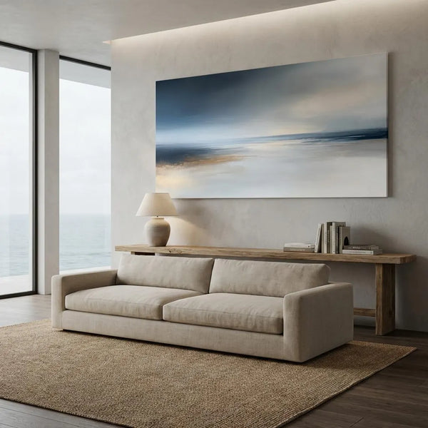
Living Room: Bold, Welcoming, Conversational
The living room is where energy and relaxation need to coexist. This is your home's social hub — a space that should feel alive and inviting, but never exhausting. Abstract prints with warm terracotta, deep amber, or rich jewel tones like sapphire and emerald strike that balance beautifully. These colors signal warmth and welcome without tipping into aggression or anxiety.
In 2026, the strongest living room trend is a single large-format framed abstract print as a room anchor — one commanding piece above the sofa or on the main accent wall. Choose a print with a dynamic but balanced composition: bold color fields that draw the eye, with enough visual breathing room to feel sophisticated rather than chaotic. Browse the living room art collection at Nova Art Labs to find statement-making abstracts in every palette.
Bedroom: Calm, Restorative, Intimate
The bedroom calls for color that quiets the mind and signals rest. Cool hues — soft blue, dusty lavender, muted sage green — are the most effective choices here. These tones are associated with relaxation, low heart rate, and the transition into sleep. Abstract prints in these palettes create a visual environment that supports unwinding.
Look for prints with gentle, flowing compositions: soft horizontal movement, open negative space, and tonal gradients. Avoid high-contrast, angular, or visually complex abstracts in the bedroom — those compositions, however beautiful, stimulate rather than soothe. A framed print in dove grey with whispers of blue above the headboard is a simple, stunning way to bring color psychology to work.
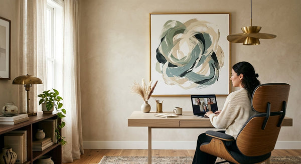
Home Office: Focused, Energized, Clear-Headed
The home office needs to do double duty — keep you alert during peak work hours and prevent the kind of overstimulation that leads to fatigue. The color sweet spot here is medium-value, slightly cool tones: slate blue, warm olive, or soft teal. These colors support sustained concentration without the aggressive energy of bright reds or the drowsiness risk of very pale neutrals.
Abstract prints with clean geometric compositions — structured color blocks, precise linear forms, clear compositional logic — work especially well in office settings. They communicate focus and order, which primes the brain for productive thinking. One well-chosen framed abstract print can transform a spare corner into a focused, design-forward workspace.
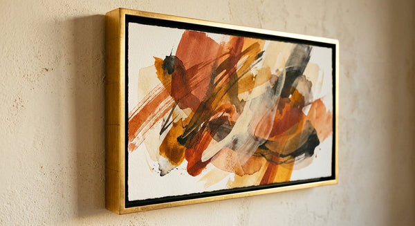
Dining Room: Appetite-Stimulating, Social, Celebratory
Color psychology has long known that warm colors stimulate appetite and encourage conversation — which is exactly what a dining room needs. Rich terracotta, warm ochre, burgundy, and saffron-adjacent tones create a festive, appetite-friendly atmosphere. Abstract prints in these palettes add energy and sophistication to the dining experience without the visual noise of pattern-heavy decor.
Consider a pair of medium-sized framed abstract prints on either side of a mirror or sideboard, or a single bold statement piece on the wall facing the table — somewhere guests will naturally look as they sit down. Warm-toned abstract art prints from Nova Art Labs make an elegant choice for this kind of dining room focal point.

Understanding Color Families in Abstract Art Prints
Not sure which color family is right for your space? Here's a quick reference for the three major groups and their emotional effects.
Warm Tones: Red, Orange, Terracotta, Gold
Warm-toned abstract art prints energize a room and make it feel inviting and intimate. They work best in social spaces — living rooms, dining rooms, entryways. In 2026, terracotta and warm sand tones are especially sought-after: they bring the psychological warmth of traditional warm hues with a more sophisticated, earthy sensibility that pairs beautifully with modern interiors.
Cool Tones: Blue, Teal, Sage, Slate
Cool-toned abstract prints create calm, expansive, and focused environments. They visually enlarge a space — particularly useful in smaller rooms — and are associated with clarity and emotional regulation. Soft sage, dusty teal, and deep navy are among the most versatile cool tones for wall art in 2026. They work across nearly every room and complement both warm-wood and white interiors.
Neutral and Earth Tones: Cream, Beige, Warm Grey, Clay
Neutral-palette abstract prints are the most universally adaptable option. They create harmony and visual rest, allowing furniture and architectural details to anchor the room while the art adds depth and sophistication. In 2026, warm neutrals — cream with ivory, warm grey with linen tones, soft clay and blush — are driving the strongest trends in abstract wall art. They feel elevated without being dominant, and they work in every room from bedroom to boardroom.
Explore Nova Art Labs' curated selection of abstract wall art prints across all three color families — with museum-quality framing included, ready to hang the day they arrive.

2026's Most Wanted Color Palettes for Abstract Wall Art
These are the five color directions driving the most interest in abstract wall art prints right now — ideal for anyone looking to make a contemporary, future-proof choice.
Warm Organics: Terracotta, warm sand, clay, and dusty rose create a grounded, wellness-forward atmosphere that defines 2026's most-shared interiors. Pair with natural wood frames for a cohesive, editorial look.
Botanical Greens: Sage, olive, moss, and eucalyptus tones are having a significant moment. These prints bring the restorative quality of nature indoors without the fragility of actual plants — bold, timeless, and calming.
Moody Blues and Indigos: Deep navy, midnight blue, and rich indigo abstract prints add drama and depth to any space. In 2026, they're especially popular in living rooms and home offices as sophisticated focal points that feel both contemporary and enduring.
Warm Neutrals with Color Accents: Cream and ivory fields punctuated by warm brushes of gold, ochre, or blush. These prints function as versatile anchors that brighten a space and coordinate with almost any existing palette.
Monochromatic Minimalism: Tone-on-tone abstract prints — soft grey on grey, ivory on white, blush on rose — are the understated choice for Japandi and minimalist interiors. They add visual interest and compositional depth without color competition.
How to Build a Cohesive Gallery Wall with Color in Mind
If you're creating a gallery wall, color psychology becomes even more important — multiple prints need to work together to create a single, unified emotional effect. The most successful gallery walls in 2026 follow one of two approaches: a tightly edited monochromatic palette (all cool tones, or all warm earth tones), or a curated complementary palette (warm and cool tones that sit opposite each other on the color wheel and create visual tension).
Limit your gallery wall to three to five framed abstract prints with clear breathing room between frames. Consistency in frame style — all matte black, all natural wood, or all white — brings cohesion regardless of how varied the art itself might be. And let one print lead: choose your dominant piece first, then build the supporting prints around its palette and scale.
At novaartlabs.com, each print is available in multiple sizes, making it easy to plan a gallery wall that scales beautifully from a compact accent arrangement to a full salon-style installation.

Frequently Asked Questions
What color abstract wall art works best in a living room?
For living rooms, abstract wall art prints in warm terracotta, deep jewel tones like sapphire or emerald, or rich earthy neutrals create the best balance of energy and welcome. These colors make the room feel inviting and alive without becoming overstimulating. Nova Art Labs offers a wide range of living room–ready abstract prints in these palettes, all museum-quality framed and ready to hang.
How do I use color psychology to choose wall art?
Start with the mood you want the room to create. Cool blues and greens promote calm and focus, making them ideal for bedrooms and offices. Warm terracottas and ambers energize social spaces like living rooms and dining rooms. Neutral earth tones create harmony and visual rest in any room. Choose your abstract art print based on its dominant color family, and let that color set the emotional baseline for the entire space.
What colors in abstract art prints make a room feel bigger?
Cool tones — particularly soft blues, muted teals, and pale sage greens — visually expand a room by receding into the wall rather than advancing toward the viewer. Light-value neutral prints in ivory, cream, or warm white also help open up a space. Abstract wall art prints with open compositions and strong horizontal movement are especially effective for making a smaller room feel more expansive.
Are warm or cool tones better for abstract wall art prints?
Neither is universally better — the right choice depends entirely on the room's purpose and your desired mood. Warm tones (terracotta, amber, gold) are better for social, energizing spaces. Cool tones (blue, sage, teal) are better for calm, focused, or restorative environments. Many of the most compelling abstract art prints at Nova Art Labs use both: a warm-cool contrast that creates visual depth and emotional complexity within a single piece.
Where can I find color-coordinated abstract wall art prints?
Nova Art Labs at novaartlabs.com offers a curated collection of modern abstract wall art prints organized by color palette, style, and room type. Every print ships from the USA with museum-quality framing, so you can browse by color family and find the perfect piece for any space — without the guesswork.

The Bottom Line: Let Color Lead
The rooms that feel the most intentional, the most alive, and the most like home are the ones where someone thought carefully about color. Abstract wall art prints give you a direct, beautiful way to do exactly that — to lead with color and let the room respond. Whether you want a living room that buzzes with warmth, a bedroom that invites true rest, or an office that keeps you sharp and focused, the right framed print is the most elegant way to get there.
Browse the full collection at Nova Art Labs and discover abstract wall art prints in every palette, style, and size — curated to transform your space from the walls out.