Color Psychology Wall Art: Choose Prints That Transform Every Room
Imagine walking into a room and feeling immediately at ease — shoulders dropping, breath slowing, a quiet sense of rightness settling over you. That response is not accidental. It begins with color, and in modern interiors, nothing delivers color with more intention and impact than the art on your walls.
Color psychology wall art is one of the most underestimated tools in interior design. While most guides focus on paint — the wall color, the trim — the art you choose operates at an entirely different frequency. It commands the eye, anchors the room, and shapes mood in ways that a coat of paint simply cannot replicate. At Nova Art Labs, every abstract print is designed with this visual power in mind: bold compositions, intentional palettes, and museum-quality framing that lets color work as it was meant to.
This guide breaks down the science and art of choosing wall art by color — room by room, mood by mood — so every piece you hang earns its place.
Why Color in Wall Art Hits Differently Than Paint
Paint covers walls. Art commands attention.
When you walk into a room, your eye naturally seeks the most visually complex focal point — and a framed abstract print, with its layered composition and deliberate palette, becomes exactly that. The colors in abstract art prints are not passive background tones. They are active participants in how a room feels, and because they exist within a concentrated focal zone, their psychological effect is amplified.
Research into color psychology consistently shows that warm tones — deep ochres, burnt oranges, terracotta — raise energy levels and encourage social connection. Cool tones — soft blues, grey-greens, dusty lavenders — lower heart rate and promote calm. Neutral anchors like charcoal, ivory, and warm black provide sophistication and visual rest. When these colors are rendered in a complex abstract composition — gestural marks, overlapping forms, dynamic interplay of light and shadow — their emotional resonance deepens further.
This is why wall art colors for mood are not a soft consideration. They are a design decision with measurable impact.
The Color-Emotion Map: What Each Palette Does to a Room
Warm Earths and Ochres: Grounding and Inviting
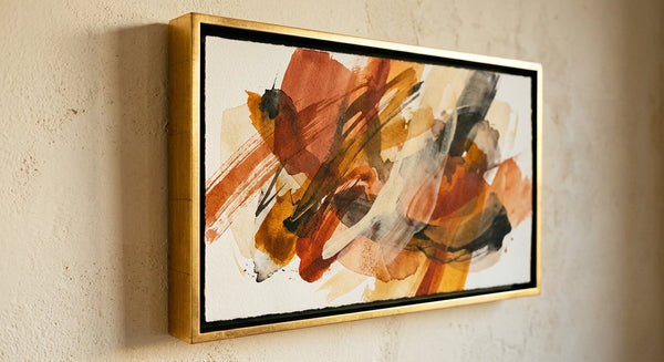
Terracotta, amber, deep ochre, and burnt sienna are the dominant tones of 2026's most-requested abstract art palettes. These warm earth tones carry the psychological weight of the natural world — the reassurance of sun-warmed stone, autumn light, clay and soil. In a living space, they create instant warmth and approachability.
Abstract art prints in warm earth tones are particularly effective in living rooms, dining rooms, and entryways — anywhere you want a space to feel welcoming and lived-in rather than clinical or sparse. Pair them with natural wood frames, linen textiles, and warm ambient lighting for a cohesive, grounded interior.

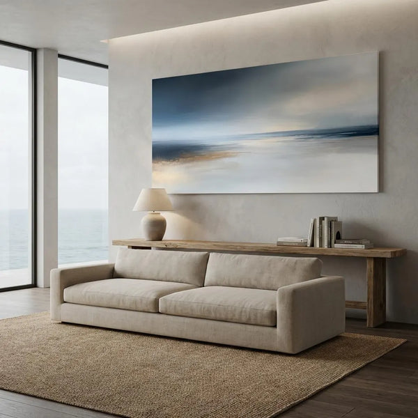
Deep Blues and Indigos: Calm, Depth, and Focus
Navy, deep teal, and indigo have long been the designer's choice for spaces that need to communicate both authority and ease. In abstract art, these palettes translate to pieces that feel simultaneously expansive and intimate — as if the composition holds depth you could step into.
For home offices and reading corners, abstract wall art for living room and workspace settings in deep blue tones promotes sustained focus. For bedrooms, navy and midnight teal become deeply restful. Studies in environmental psychology note that blue-dominant spaces measurably reduce cortisol levels, making them among the most effective color choices for high-stress modern interiors.
Sage Greens and Ivories: Serenity and Japandi Calm
The Japandi aesthetic — that serene marriage of Japanese minimalism and Scandinavian warmth — relies heavily on a palette of sage, moss, warm ivory, and pale stone. Abstract art prints in these tones are among the most versatile in any collection: they bring organic life to minimalist rooms without disrupting their quiet logic.
Sage and ivory abstract compositions work beautifully in bedrooms, spa-style bathrooms, and any space designed around mindfulness or rest. The muted complexity of these palettes rewards extended looking — the more time you spend with them, the more you see.
Moody Blacks and Charcoals: Drama and Sophistication
High-contrast abstract prints anchored in charcoal, graphite, and ink-black are having a defining moment in 2026 interiors. These are statement pieces with an editorial edge — works that announce a refined sensibility and confidence in design.
In dining rooms, dark hallways, or home libraries, a large-format abstract print in a monochromatic or near-monochromatic palette becomes genuinely dramatic. Against lighter walls, the contrast is arresting. Against dark feature walls, the layered tones create a rich, enveloping depth.
Room-by-Room Color Psychology Guide for Abstract Art Prints
Living Room: Energize Without Overwhelming
The living room is your home's social heartbeat — a space that needs to feel welcoming to guests while remaining livable over long stretches. The most successful color psychology wall art choices for living rooms use warm, dynamic palettes that energize without agitating.
Consider abstract art prints in terracotta and gold, deep rust and cream, or expressive warm neutrals with gestural marks. These compositions create a focal point that draws people into the room and encourages conversation. A large-format framed print centered above a sofa or console table anchors the entire space — and choosing wall art by color here means letting the art set the room's emotional tone from the first glance.
At Nova Art Labs, the abstract collection includes multiple warm-palette statements designed specifically for living room scale — pieces that make the furniture arrangement feel intentional rather than incidental.
Bedroom: Rest, Restore, Romance
Bedrooms ask for restraint. The goal is to design a room your nervous system recognizes as a place of rest — and color is the most powerful signal you can send.
Abstract art prints in cool blues, soft sage, and warm ivory are the most consistently effective bedroom choices. They signal calm without coldness. Deep indigo and midnight teal abstract prints can also work beautifully in bedrooms designed around romance and sensory depth, particularly when framed in warm copper or dark walnut.
Avoid high-contrast red or orange abstracts above the bed — their psychological energy is stimulating rather than restorative, which works against sleep quality.

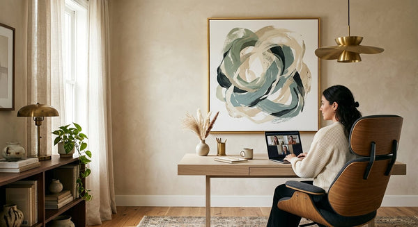
Home Office: Focus and Flow
The home office is perhaps the most psychologically precise placement decision of any room. Wall art colors for mood in a workspace need to support sustained concentration without inducing anxiety, and foster creativity without distraction.
Deep blues and teal abstract prints are consistently the top performers in office settings — the palette supports logical thinking and stamina. If your work is more creative or intuitive, a rich green or a warm neutral abstract art print introduces organic energy without overwhelming the space. Avoid highly saturated, busy compositions in small offices; look for abstract prints with clear compositional hierarchy: a strong focal point and supporting elements that recede gracefully.
How to Apply Color Psychology When Choosing an Abstract Print
Choosing wall art by color is more nuanced than matching swatches. Here is a framework that actually works:
Start with the emotional intention, not the room's existing palette. Ask yourself: how do you want to feel in this room? Grounded? Energized? Calm? Creatively alive? Let that intention guide the palette before you consider what the furniture is doing.
Choose one dominant color and let it lead. Complex abstract prints layer many tones, but the best compositions are led by one dominant hue. That hue becomes the room's emotional anchor.
Consider the light. North-facing rooms with cool, flat light benefit enormously from warm-palette abstract art prints — ochre, amber, and terracotta compensate for the lack of sun. South-facing rooms that flood with afternoon light can support cooler, deeper palettes like navy or sage without feeling cold.
Match frame to palette, not to furniture. A warm earth-tone abstract print belongs in a honey oak or warm gold frame. A cool blue or sage print reads best in matte black, dark walnut, or antique pewter. The frame bridges the art and the room.
The curated collections at novaartlabs.com are organized by palette, making it easy to browse by color intention rather than scrolling through hundreds of unrelated prints.
Frequently Asked Questions About Color Psychology Wall Art
What color abstract art is best for a living room?
Warm earth tones — terracotta, ochre, deep amber, and warm ivory — are consistently the most effective color psychology wall art choices for living rooms. They create a welcoming, energized atmosphere that encourages social connection. At Nova Art Labs, the warm abstract collection includes large-format prints specifically scaled and composed for living room placement.
How does wall art color affect mood in a room?
Color directly influences psychological and physiological responses — warm tones raise energy and encourage social engagement, while cool tones lower heart rate and promote calm. In abstract art prints, these effects are amplified because color operates within a concentrated focal composition rather than as passive background. The right wall art colors for mood can measurably shift how a space feels to anyone who enters it.
What wall art colors make a room feel calm?
Soft sage green, dusty blue, warm ivory, and muted teal are the most effective calming palettes for abstract wall art. These tones are associated with nature, stillness, and rest. For bedrooms and wellness-focused spaces, Nova Art Labs offers abstract art prints in these soothing palettes, all available with museum-quality framing.
Can I use dark or moody abstract art without making a room feel smaller?
Yes — the key is scale and lighting. A large-format abstract print in charcoal or deep navy actually creates visual depth that makes a room feel more expansive, not smaller. Use atmospheric lighting — warm side lamps, picture lights — to prevent the print from disappearing into shadow, and choose a frame that creates clear separation from the wall.

How many abstract art prints should I use in one room?
One large statement print is almost always more impactful than multiple small pieces. If you want a gallery wall, choose prints with a cohesive palette — varying tones of the same color family, or a limited two-color palette across all pieces. Novaartlabs.com offers curated sets designed to work together as a collection.
Transform Your Space with the Right Color
Color is the most powerful invisible force in any room — and wall art is how you wield it with intention. Whether you are choosing abstract art prints to restore calm in a bedroom, inject warmth into a living room, or bring focused energy to a home office, the palette you choose shapes every moment spent in that space.
Start with how you want to feel. Let color psychology wall art guide the rest. Browse the full collection at Nova Art Labs — where every abstract print is chosen for visual impact, emotional resonance, and museum-quality presentation. Find your palette at novaartlabs.com and transform the rooms you live in.