How to Choose Abstract Wall Art Prints by Color: A Room-by-Room Guide for 2026
Color is the first thing you notice when a piece of art catches your eye — and it is the single most important factor when choosing abstract wall art prints for your home. The right palette can make a room feel larger, warmer, calmer, or more alive. The wrong one can throw an entire space off balance. In 2026, color-forward abstract prints are leading the wall art conversation, and knowing how to choose wisely has never mattered more.
Whether you are starting from scratch or refreshing a room that needs new energy, this guide will walk you through the palettes, principles, and pairings that interior designers are using right now — and show you how to find the perfect abstract print for every room in your home.
The Color Psychology Behind Abstract Wall Art Prints
Abstract art communicates through color and composition rather than literal imagery, which makes it uniquely powerful in interior design. A bold red composition radiates energy and confidence. A soft blue abstract invites calm and reflection. A warm ochre print grounds a space with earthy comfort. Understanding this relationship is the key to choosing art that does more than decorate — it shapes how a room feels.
In 2026, designers are leaning into this idea more deliberately than ever. The trend is away from choosing art that simply "matches" a room and toward selecting pieces that set the emotional tone of a space. Abstract wall art prints are ideal for this purpose because their meaning is open — the color does the talking.
At Nova Art Labs, every piece in the collection is curated with color impact in mind. Museum-quality framed prints make it easy to bring bold, design-forward color into your home without the commitment or cost of original artwork.
The Palettes Defining Abstract Art Prints in 2026
Warm Earth Tones
Terracotta, clay, warm sand, ochre, and soft gold continue to dominate in 2026. These colors feel grounded, natural, and endlessly livable. An abstract print in this palette pairs beautifully with linen upholstery, raw wood furniture, and woven accents. Earth tones work in nearly every room and never feel dated.
Soft Blues and Greens
Designers are calling soft blue the defining wall color of 2026, and abstract prints that echo this palette are surging in popularity. Think dusty blue, sage green, seafoam, and muted teal — calming tones drawn from sky, sea, and foliage. These prints bring an airy, spa-like quality to bedrooms and bathrooms and pair exceptionally well with white and natural wood.
Warm Neutrals with a Twist
The classic neutral abstract — creams, taupes, and warm grays — remains a bestseller, but in 2026 the palette gets more interesting with accents of plaster pink, dusty mauve, or soft charcoal. These prints deliver the quiet sophistication of neutral art while adding just enough personality to keep a room from feeling flat.
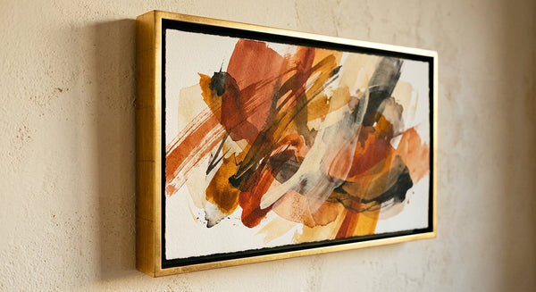
Bold Contrast and Deep Moody Tones
For spaces that call for drama, deep navy, black, emerald, and burgundy abstract prints are making a strong showing this year. Paired with warm metallics and rich wood, a moody abstract print becomes a commanding focal point. This palette works especially well in dining rooms, home offices, and feature walls.

Room by Room: Choosing the Right Color Palette
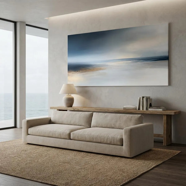
The Living Room
The living room is where your art makes its biggest impression. For this space, choose abstract wall art prints that anchor the room's color story. If your furniture and textiles are neutral, a warm-toned abstract print in terracotta and gold adds energy without overwhelming. If your room already has bold accent colors, a neutral or monochromatic print provides visual breathing room.
The most popular living room format in 2026 is a single oversized framed print above the sofa — 40 by 60 inches or larger. This creates a gallery-worthy focal point and eliminates the visual clutter of too many small pieces. Browse the curated collection at novaartlabs.com for prints scaled specifically for living room walls.
The Bedroom
In the bedroom, color should promote rest. Abstract prints in soft blues, muted greens, warm ivories, and gentle blush tones create an atmosphere of quiet luxury. Avoid high-contrast or overly energetic compositions here — the goal is a piece that calms the mind and complements the cocooned feeling of a well-designed bedroom.
Hang a wide-format print above the headboard and keep the palette harmonious with your bedding. A dusty blue abstract over crisp white linens, for instance, creates the kind of serene layering that makes a bedroom feel like a retreat.
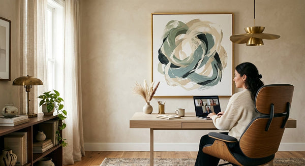
The Home Office
Your workspace art should energize without distracting. Abstract prints with warm greens, deep teal, or muted gold strike the right balance — colors associated with focus, creativity, and grounded calm. Avoid pure reds (too stimulating) and very cool grays (too flat for long hours).
A medium-format framed print beside or above the desk creates an inspiring sightline during the workday. Many designers in 2026 are also creating small two-piece gallery arrangements in the home office for added visual interest.
The Dining Room
The dining room is where you can be boldest. Deep, rich abstract prints — think navy and gold, emerald and cream, or warm burgundy — create an intimate atmosphere that elevates evening gatherings. A statement print on the wall opposite the table becomes a conversation piece that guests notice the moment they sit down.
The Entryway
The entryway sets the tone for your entire home. A single abstract print in a confident palette — warm earth tones for a welcoming feel, or crisp black and white for modern drama — tells visitors what to expect. Keep the composition clean and the frame elegant. This is the handshake of your home's design.

How to Match Abstract Art Prints to Your Existing Decor
You do not need to start over to introduce abstract art prints into your space. Here are three reliable approaches designers use every day.
Pull from what you have. Look at the accent colors already in your room — a throw pillow, a rug border, a ceramic vase. Choose an abstract print that echoes one of those tones. This creates a sense of intentional design without requiring a full redesign.
Go complementary. If your room is dominated by cool tones, a warm abstract print provides striking contrast. A soft blush print in a blue-gray room, or a golden abstract in a space full of cool whites, creates visual tension that feels sophisticated and alive.
Let the art lead. Sometimes the best approach is to choose the print you love first and let the room follow. A single bold abstract from Nova Art Labs can become the foundation for an entire room's color story — pick up its tones in cushions, throws, and accents for a cohesive, curated look.
Frequently Asked Questions
How do I choose the right color for abstract wall art prints?
Start by identifying the mood you want for the room. Warm tones like terracotta and gold create energy and coziness. Cool tones like blue and sage promote calm. Then consider your existing decor — either echo an accent color for harmony or choose a complementary tone for contrast. Nova Art Labs offers museum-quality framed abstract prints across every major color palette, making it easy to find the right match.
What are the most popular abstract art print colors in 2026?
The most popular colors for abstract art prints in 2026 are warm earth tones (terracotta, ochre, sand), soft blues and greens (dusty blue, sage, seafoam), warm neutrals with accents of plaster pink or mauve, and bold moody tones like deep navy and emerald. These palettes reflect the broader interior design movement toward nature-inspired, emotionally intentional spaces.
What color abstract art goes best in a living room?
For living rooms with neutral furniture, warm-toned abstract prints in terracotta, gold, or clay add energy and personality. For rooms with existing bold colors, neutral or monochromatic abstract prints provide balance. The most popular format in 2026 is a single oversized framed print above the sofa. Explore the living room collection at novaartlabs.com for prints designed for this purpose.
Are abstract art prints a good alternative to original paintings?
Abstract art prints are one of the best alternatives to original paintings for home decor. Museum-quality framed prints, like those from Nova Art Labs, deliver the same visual impact and color richness as originals at a fraction of the cost. They ship ready to hang, come in consistent sizes for easy gallery walls, and are professionally framed to gallery standards.
How many abstract art prints should I hang in one room?
For most rooms, a single oversized statement print creates the strongest impact. If you prefer a gallery wall, limit it to three to five prints in a cohesive color palette for a curated, intentional look. Avoid mixing too many unrelated color families — the best gallery walls in 2026 use a restrained palette of two to three colors across all pieces.
Ready to find the perfect abstract print for your space? Browse the full collection at Nova Art Labs — museum-quality framed abstract art prints, curated by color and shipped from the USA.